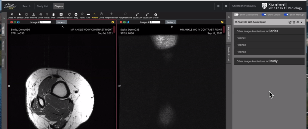
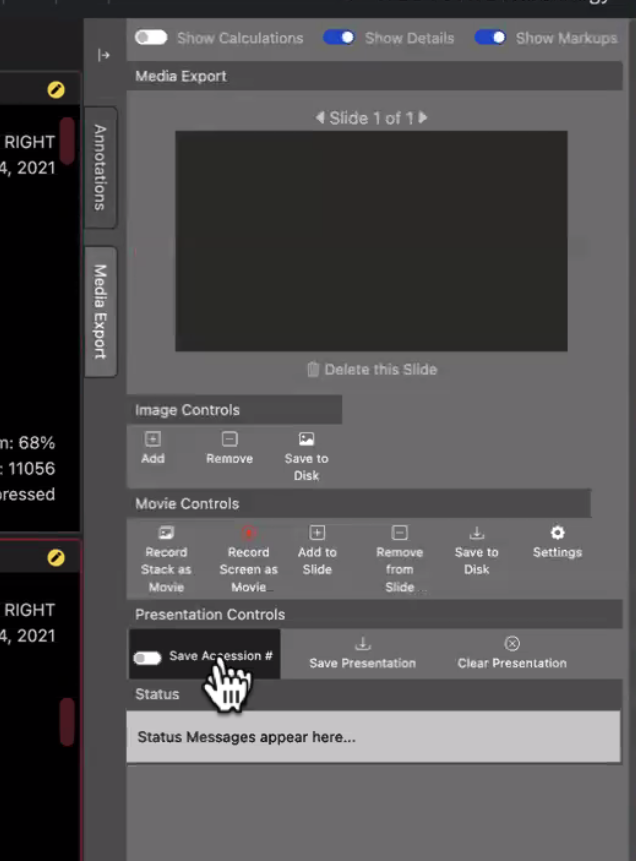
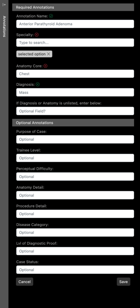
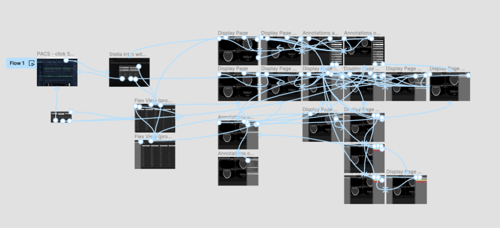
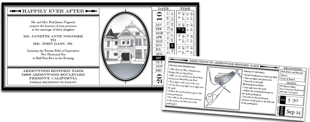
Amy Thomas

Senior Designer

(980) 505-7779

Software UI Design
Mockup of Search Page
Beta View of Annotations Drawer View Mode
Beta View of Media Export Panel
right panel - edit
LoFi Mockup of Edit Mode for Annotations drawer
Mockup for all popup screens
Mockup for all Modal Popups
Figma prototype
Figma Prototype

UI Design

Prototype

React.js Component Theming

Web Design

Project Summary

This interface was produced by the development team, using the default design of the code base. The software is unique in that it is primarily used in a dark radiology reading room where a darker interface works best. Our stakeholders felt that it looked dated and too much like the original product. I was brought in during user research, after initial development, to interpret user needs and develop an interface that was more modern and user friendly. I worked closely with the development team and the primary stakeholder.
 

Biggest Challenge:

There was already an interface, so the developers did not want to spend extra time re-coding the interface to make match the designed prototype. To help with their resistance, I coded the elements and sent them the source files to add to their code base. This allowed them to keep working on the functional parts of the software and helped us meet our MVP deadline. 

Radiology Research Website
Home Page
Sub-section layout, with section-level, expandable left navigation
Library feature
Library feature with sort and filter capabilities

UI Design

Web Development

Drupal Theming

Web Design

Project Summary

I worked with an interdisciplinary team staff and faculty to redesign our existing research website. We wanted a modern look and feel with our new and improved content easy to find. 

Our first discussions revolved around defining users, once we had a clear idea of each of the five types of users. We set out on defining the journey for each one. A lot of these journeys ended up with overlapping pieces, so we wanted to make sure that the experience for each user was comparable. 

The Build:

Since our content was so robust and we needed to make it easy to find for each user type, I opted to use Drupal as the backend so that I could customize our data access and display. The theme is based on Bootstrap 5 with each element custom styled in CSS and available as an independent component in our style library. 

Biggest Challenge:

The biggest challenge was the large team size and the new data we were tasked to make available. We negotiated these challenges by separating our core team into a weekly staff meeting and then a monthly whole team meeting including the stakeholders. Our finished result has received great feedback. 

Radiology Diversity
Home Page

UI Design

Web Development

WordPress Theme Design

Web Design

Website with scroll
Home Page
Weekly Newsletter Repository
Newsletter Search Page
Finance Managers
Finance Manager Search Page

UI Design

Web Development

Drupal Theme Design

Web Design

Project Summary

The Department needed a system that made it easy for users to find out who supports who and how to contact each person. We started with a print version of the face sheet and wanted to make something more interactive from the printed document. 

I worked with a small team to conduct user research and find out what the needs of the different user roles were. I worked with the executive team to define the initial problem and get clarity on the desired outcome. Finally, I worked with the individual department units to refine the deliverables for each associated page.

Biggest Challenge:

During our research, a few items came up as the most important to our user base:

  1. easy way to find contact information and affiliation for administrative staff
  2. easy way to find out which faculty member is supported by each admin
  3. easy way to find the finance manager associated with a specific faculty
  4. searchable repository for our weekly newsletters
 
Users: 
During the discovery process, we identified 5 unique personas, each with 4 mostly independent journeys. We were able to tailor the journey to the persona in a way that was most efficient for each. The application has been well-received and garnered praise from each user type.  


Solution:

I used Drupal to build the system, since it had the most robust and customizable content management features. The main page mirrors the older printed face sheet that the system was based off. However, on this site, you can now click on a person’s name to drill down into their “personnel card” and see the details specific to them, including who they support and their contact information. Separate pages were added for searching finance managers and associated details and for searching the weekly newsletters.

(note: due to the internal nature of the site’s content, screenshots are limited and obscured)

Logo Design
Logo Design
Home Page with New Logo
AMPF
Home Page with Temporary Logo

Logo Design

Web Development

WordPress Theme Design

Web Design

Annual Report Cover
Annual Report Cover
Radiology Department Report - Spread

Graphic Design

Print Production

Page Layout

Digital Collateral

Project Summary

Continuing project working with a multidisciplinary team to design and produce the department’s annual report. I have been the lead on design and production for the Report since 2008.

Repository of Annual Reports »

Journal Design
Home Page
Program Booklet -interior spread 1
Program Booklet - Interior Spread 1
Program Booklet -interior spread 2
Program Booklet - Interior Spread 2
Event Slides 1
Home Page
Event Slides 2
Slide Deck - Slide Sample 2

Graphic Design

Print Production

Page Layout

Digital Design

Project Summary

The team for this annual event reached out to me again this year to develop their print collateral. The wanted to design a cover for a blank journal that would be used as a ‘Thank You’ gift for the speakers. They also needed a Program booklet printed and a slide deck built.

The Team:

As the principal designer for this event collateral, I worked with the executive leadership for the symposium, events team and the administrative staff.

Biggest Challenge:

The team had already created a theme graphic with an online social media creation tool. The challenge was to create event collateral that was consistent with the pre-defined graphic.

PDF flyer showing-casing speakers
Event Flyer
video placeholder image
Social Media Graphic
Email template
Email Template
Gambhir Symposium Collateral
Home Page

Graphic Design

Print Production

Web Design

Digital Collateral

Project Summary

This event was created to honor a pioneer in the fields of early detection of cancer and molecular imaging.

The overall goal of this project was to develop a theme and collateral for use during the live event. The theme should honor the professionalism and innovation of the event’s namesake, while providing a user experience that encourages attendees to return for subsequent events. 

I worked with the events team to clarify the goals of the event and collateral, as well as the social media group to update the web-based collateral to formats that work for their purposes. 

Biggest Challenge:

We needed to develop a livestream page which would maintain the branding of the event, while delivering a live video feed and a “slido” chat pane. The goal was to do this without interrupting the user experience by launching a separate site. The solution was built using a series of iframes on a single page.

Anatomy of the meeting pages
Anatomy of the booklet
Agenda for the Conference
Conference agenda in calendar form and in list form. The calendar shows who the attendees from our company will be (color coded circles), it shows the meeting type and the travel time. Each meeting is clickable and take the user to the detail page for the event (see main image above for detail page)

Graphic Design

Print Production

Digital Collateral

Project Summary

The booklet is a go-to resource for our leadership team while they are on the go at a conference in a different country. The typical event will include a full schedule of the leadership team meeting other company execs to talk about potential relationships. In previous years, this document was a simple text document with some org charts and inserted pages with supporting data. 

Biggest Challenge:

The booklet has to be portable, often carried in the jacket pocket, so space is tight. I approached the project by considering what the busy exec would need to see at a glance to get to the next meeting. After several discussions, I opted to provide a clickable PDF, as well as the printed document. Since the event was in a different country, we could not rely on cellular/wifi for maps and directions, so I put screenshots in to help, as well as area maps, the exhibit hall maps and walking directions from place to place with estimated travel times between meetings/locations. 

The book was well received. Leadership liked how easy it was to follow and how all of the important information was put in the booklet for them. They loved the option to use it on their devices with clickable links throughout. 

* text obscured due to confidential nature of booklet

Speaker Highlight on Social
Social Media - Speaker Highlight
Event Signage - Agenda 36"x 24"
PPT Slide Deck
PPT Slide Deck
Social Media - Event Promotion
Sponsorship Flyer
Sponsorship Flyer
PPT Slide Deck
PPT Slide Deck
PHIND Gambhir Symposium - redesigned
Event Website

Graphic Design

Print Production

Web Design

Digital Collateral

Large Scale Event Backdrop
Event Brochure and Facility Brochure
Agenda Sign - 24"x36" on posterboard
Speaker Check-in Sign - 24"x36" on posterboard
Event Brochure and Facility Brochure
Large Scale Welcome Sign - 36x48
Social Media - Event Promotion
Event Brochure and Facility Brochure
CRF Grand Opening Event Website

Graphic Design

Print Production

Video Editing

Digital Collateral

Kidney
Home Page

Scientific Illustration

3D Art & Rendering

Print Ready Art

Project Summary

I worked with the primary physician scientists for this project. Their work was accepted to the journal and they were asked to generate something unique for the cover that depicted their work.

The image shows “the independent and synergistic effect of sound waves (curved white lines) and mesenchymal stem cells (which are arriving at the kidney via its blood supply) in stimulating kidney regeneration following injury. The small yellow circles represent the release of growth/regeneration-promoting factors following treatment.”

Biggest Challenge:

The challenge with this illustration was showing the complex vasculature and its association with the renal lobes. This vasculature is important to the therapy in that the physicians can use the vasculature to deliver the treatment and use the focused sound waves to activate the treatment, hence minimizing systemic exposure to treatment. 

Scaffold
Home Page

Scientific Illustration

3D Art & Rendering

Print Ready Art

Project Summary

The Physician-Scientist was asked to provide a cover image to represent his work. I worked with him to understand the science behind his team’s work. I then used scientific images as a basis to reproduce each element in the 3D environment.

The lab designed a macroporous collagen-based bioscaffold to facilitate transplantation of pancreatic islets.

Biggest Challenge:

The main challenge with this project was showing the interaction between the scaffold, the islets, the blood supply and the release of oxygen. Since a lot of this image is an artistic representation of the actual biological elements, I used a scan of the bioscaffold as the background to help bring  scientific accuracy back into the composition.

AFM Journal Cover – April 2020

Book Illustrations

Scientific Illustration

Print Ready Art

Pectoral Illustration

Scientific Illustration

Print Ready Art